
The evening before writing this I was sat at my workbench putting some transfers onto some of my wagons. This included a pair of Gunpowder vans, a GWR Z4 and a BR clasp brake 1/261. To do this, I reached for my sheet of Cambridge Custom Transfers. On this there are more Gunpowder van transfers than anyone could possibly need, and it includes numbers for both the types that I was doing. When you look at the sheet, one thing becomes immediately apparent and that is that everything looks very similar. The numbers, prefixes and tare weights vary but the size and layout of everything is the same. There is no real variation, aside from a different script for the tare weights on the GWR vans. This proved to be a bit of a problem. The transfers for the GWR Z4 were fine, they fitted nicely, but when I put the transfers for the BR clasp braked van up against the model the lettering on the left hand end didn’t fit, it was too long. The problem lies in the fact that the spacing of the stanchions on the clasp braked vans was different to the others and there was less space at the ends. This was either not appreciated by Mr Isherwood or the transfers were simply done to fit a generic body, possibly the Dapol one? I don’t think this is an unreasonable approach, given how long it can take to draw up transfers, but it doesn’t help if you are trying to model something rather than just create a model.
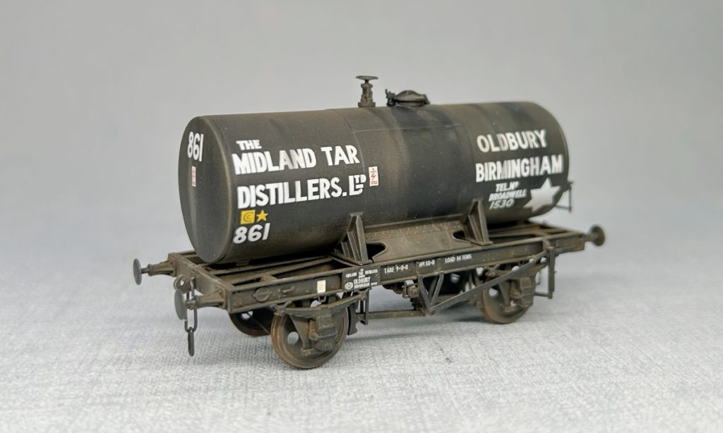
I’ve always had a bit of an issue with transfers from the trade. Some are good but I have found many that didn’t really match what I was looking at in wagon photos. Some sold as 4mm are probably to a different (larger) scale, others very clearly done to a template. Most seem to have been done with the official instructions with regards to size and layout in mind which is fine for a lot of stuff when new but once the wagon repairers got their hands on things these things went awry. Some will extol the virtues of their printing system over others, but it doesn’t really matter if the content isn’t right. Transfers from different manufacturers sometimes look different so it’s not straightforward to mix and match.
Then there’s the question of fonts. Whilst BR lettering was supposed to be Gill Sans, but much was done by hand and it varied. You could probably go on forever examining the nuances of such things and whilst potentially interesting it won’t help to get models finished. There is a point though, like with the BR clasp braked Gunpowder van, where getting a model finished means that you do have to look at such things and as a result, somethings may end up being more important than others.
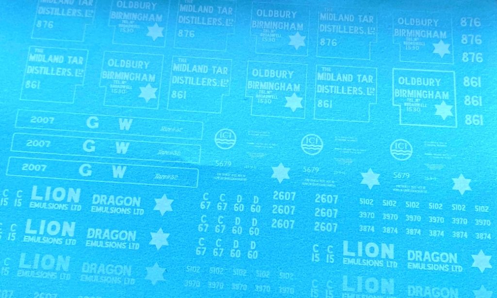
A few years ago, I decided that the only way to get transfers that matched the wagons that I was trying to or wanted to model was to roll up my sleeves and do my own. It is frustrating when you spend a lot of time creating a model and have to put something on at the end which doesn’t really look right or can’t put anything on at all because it doesn’t exist! Help is at hand though, in my case via the very helpful John Peck at Precision Decals. In exchange for a pdf and some cash he will supply you with white (or colour) transfers to your artwork and as you have done it yourself, there is nobody else to blame if it doesn’t look right.
All of my transfer artwork is drawn up in AutoCAD LT. I use it on a daily basis so I’m very familiar with how it works and it will export a vector pdf. Most vector drawing programs will probably do though. The transfers usually start with a photo of the prototype around the time I’m modelling and some form of outline of the model. Often this would be artwork for the kits I’ve done, or sketches done from measurements, but I find myself increasingly scanning sides of plastic kits on my HP laser printer and once scaled use that as a background to put the lettering over.
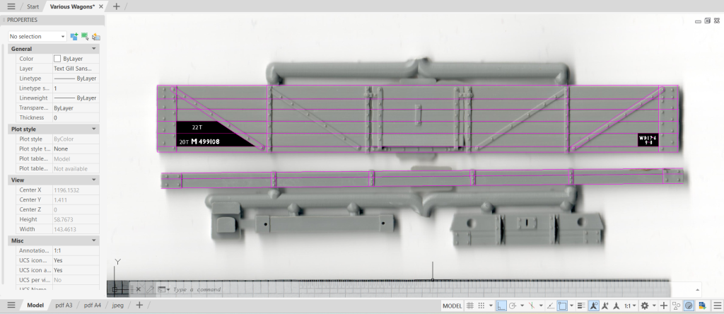
Larger text and symbols are done from scaled photos. Outlines are drawn using lines, arcs and circles and then filled in with solid colour. These can be scaled as required and the ‘lineweight’ increased or reduced by offsetting the outlines and rehatching.
AutoCAD supports a range of fonts. Most of these are of no use at all but it has a small range of Gill Sans that can be used. I will freely admit that most of my small lettering is Gill Sans MT, either standard or condensed. This is not quite right for the Gill Sans that BR specified but when you are dealing with lettering that is less than 1mm high, I’m not sure it really matters. In larger scales that may be a different but having done transfers for a fair number of wagons now I feel that there are more important things to focus on.
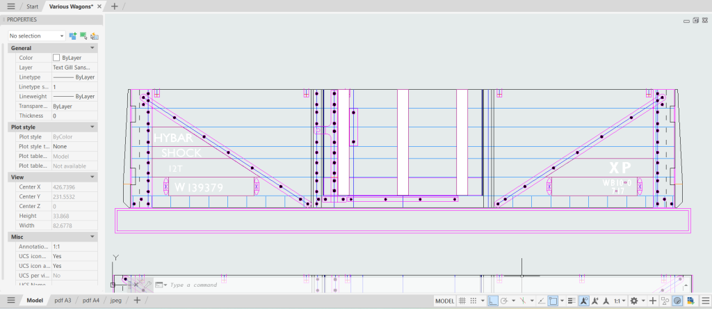
One of the things that becomes quickly apparent when you start to look closely at wagons from the late BR steam era is the size and positioning of all the elements and how much it differs from the official instructions. These instructions were published in Part 3 of the 4mm Wagon by Geoff Kent (Wild Swan) and are also covered online by the Quorn Wagon and Wagon group on the Great Central. Things were generally where you’d expect them with numbers and load to the left and the tare, etc to the right, be but letting was often bigger, sometimes appreciably so, and the exact position seemed to have been done at the whim of the signwriter. You can forget the specified gaps between things. My impression is that generally new wagons were fairly close to the instructions though they had their moments and of course sometimes features of the wagon just simply got in the way, but once the wagon repairers got their hands on them, things really started to deviate. To me, this variation in size and position is far more noticeable than the nuances of the font in very small letters or numbers. In an ideal world everything would be right, but time never stands still and there are models to be built and finished. I feel this approach is a good compromise.
For very flowing handwritten script as you found on the solebars of tank wagons and inscriptions on GWR wagons I use something called Commercial Script BT. There is much messing around with the size and spacing of it, but I think it can look ok and gives the right impression. It isn’t correct but compromise comes into play again. The thought of doing that kind of script ‘by hand’ using outlines and fills makes me want to go and lie down in a darkened room…
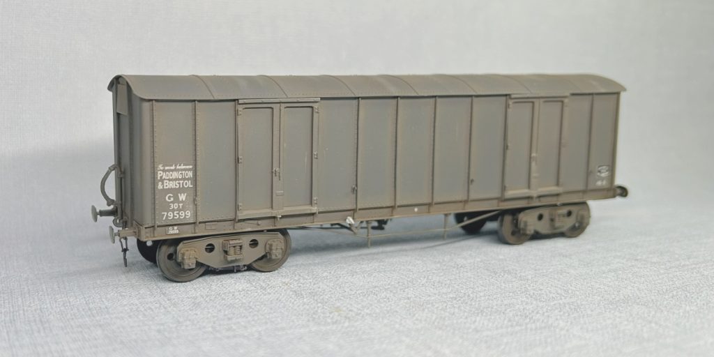
There is the question of variety that was brought up earlier, but I will make sure that transfers from the trade will be used on appropriate wagons to mix things up a bit.
If you are thinking of doing some custom transfers for yourself, I would thoroughly recommend taking the plunge. Unencumbered by what others have chosen to do, it can add a whole new layer of realism to your models and gives you the scope to do things that would otherwise be unfinishable.
Justin Newitt – October 2026